TF2 HUD Editing Guide
The Basics
This section of the guide details what resource files are, their structure and how to edit them.
top
How to Edit
This section might seem short. It outlines concepts which are detailed elsewhere in this guide. Its a basic outline to give you an idea of what to do.
- Setup up the Resource Files in your TF2 Installation - this step here
- Decide what on the HUD you want to edit, and open the corresponding HUD file - resource list
- Edit the Resource File
- Add Controls
- Remove Controls
- Change Properties
- Save the Resource File
- Relaunch TF2 or use the hud_reloadscheme console command
This is the basic process involved in editing the HUD. You will need to edit files and check their results over and over until its to your liking.
top
Resource Files (.res)
Resource files are the files the define the HUD's appearance. These are what we want to edit. They are plain text files with the .res extension. They use a simple scripting language in which controls with properties are defined in a braced structure.
top
Controls
Control is a computer programming term meaning an element of a graphical user interface (more info on that here). Basically controls are things on the HUD. Such as your health and ammo numbers. The basic control types are:
- Label (Label, CExLabel): A piece of text.
- Button (Button, ImageButton, CExButton, CExImageButton): Objects that execute functions when clicked.
- Panel (ImagePanel, EditablePanel): Pictures and blocks of color.
Each control is encased by braces, containing a list of properties (with their values) and sometimes sub-controls. Here is an example of one:
"DoodleHUDLabel"
{
    "ControlName"	"CExLabel"
    "fieldName"		"DoodleHUDLabel"
    "font"		"DefaultLarge"
    "labelText"		"DoodleHUD"
    "textAlignment"	"center"
    "xpos"		"c-128"
    "ypos"		"c-40"
    "zpos"		"-2"
    "wide"		"256"
    "tall"		"64"
    "visible"		"1"
    "enabled"		"1"
    "fgcolor_override"	"0 153 0 255"
}
The Control's name, opening brace, list of properties and then the closing brace.
top
The Box Model
For the HUD, the TF2 screen size is divided up into units. It is always 480 units tall and the width varies based on the resolution TF2 is running at.
- 16:9 ratio resolutions (such as 1920x1080) are 853 units wide
- 4:3 ratio resolutions (such as 1440x1080) are 640 units wide
- 5:4 ratio resolutions (such as 1024x819) are 600 units wide
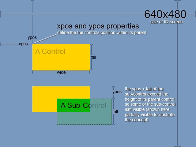
Every Control on the HUD has an X and Y coordinate that positions it on this grid. Some controls are inside another control, and are limited to the area of that control.
Each Control has a width and height (wide and tall properties) that define their display area. Any sub-controls must stay within this area.

In this example: Blue is the full screen size, yellow is a control, and green is a sub-control to yellow.
xpos, ypos, wide and tall are all properties of controls, and they are what makes up the box model. All their values are in the HUD units. A control that has a value of 48 on its tall property will always be 1 tenth (48 / 480) of the screens height, no matter TF2s resolution.
xpos and ypos
xpos and ypos are properties. Their value is the distance from the top left corner of their parent. They can also be positioned relative to different points using modifiers in the value.
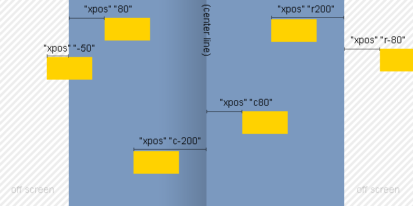
- Values preceded with an r are positioned from the right (xpos) and bottom (ypos) of the screen.
- Values preceded with a c are positioned from the center of the screen.

In this example demonstrates different modifiers to xpos values. Blue is the screen. Yellow is the controls.
Note: Positive and negative values with the r modifier are reversed compared to no modifier and the c modifier.
wide and tall
wide and tall are properties. They are the width and height of the control. All controls have wide and tall properties.
f0 is a special value for both wide and tall, which will make the control the full width and height of the screen. However this is only useful for width, since screens height is always 480.
top
Properties
A property is a piece of data that defines a specific aspect of a control. There are a few properties that apply to all controls, and there are properties that only apply to certain controls types. The property is defined on the left and the value of the property on the right. Like this:
"xpos"		"c-128"
"ypos"		"c-40"
"wide"		"256"
"tall"		"64"
Below is a list of the main properties:
| Property: | Description and Possible Values: |
| ControlName | This is the type of control. This must be of an existing control type. You can't make up your own. |
| fieldName | The unique name of the control. For existing HUD controls you must leave this as is. For controls you are adding yourself this must be unique and only use letters and numbers. |
| xpos | The X and Y position of the top left corner of the control within its parent boundary. Special value modifiers r and c change where the values a relative to (see above). |
| ypos | |
| zpos | The controls layer. Layers are the order in which things are drawn. If you want something to appear on top of something else in the HUD, for example a label on top of a image panel, you must has it's zpos higher. zpos can be negative, but higher numbers are always drawn on top. |
| tall | The width and height of the control. (see above) |
| wide | |
| visible | visible determines whether the Control is visible. enabled determines whether the Control is loaded at all. The values for both these properties can be either 1 for true or 0 for false. The reason there is two properties for (pretty much) the same thing, is the HUD toggles a lot of controls between visible and hidden, for this it animates the visible property. The enabled property is to disable these controls regardless of animation. However some controls cannot be disabled due to their nature. |
| enabled | |
| FgColor | The color of the text of the control. Value can be a space delimited RGBA color or a named color (more on colors). Some controls wont change color, for those try the fgcolor_override property. |
| BgColor | The background color of the control. Value can be a space delimited RGBA color or a named color (more on colors). Some controls wont change color, for those try the bgcolor_override property. |
| border | The outline of the control. This property is for things like buttons and panels. Values must be a border defined in the clientscheme.res. |
| font | The font of the text in the control (for things like labels and buttons with text). You must use a font defined in the clientscheme.res. |
| labelText | The text on the control. Either a button or a label. More on Label Text |
| textAlignment | The alignment of the text within its box. This property uses the cardinal directions for values as well as "left", "right" and "center". To enter more than one alignment you must use the cardinal directions with the vertical alignment first, for example "north-west" for top left alignment. More on Images |
| textinsetx | Distance from the edge of the controls box the text is. This property works with all alignments of the text (see textAlignment). |
| textinsety | |
| image | For image controls, this is the path the image. The path is relative to the tf/materials/vgui folder. |
| paintbackground | paintbackground determines whether the background of the control is visible, paintborder determines the same thing for the border. The values for both these properties can be either 1 for true or 0 for false. I recommend using a completely transparent background color and NoBorder to get rid of the background and border instead of these. But they are often required to turn on the background and border of controls since the set scheme for some controls is 0. |
| paintborder |